
Integration with Shopify

Let’s create a small ecommerce with several goods for sale using Shopify.

1. Customizing Shopify#

1.1 Creating a Shopify account#

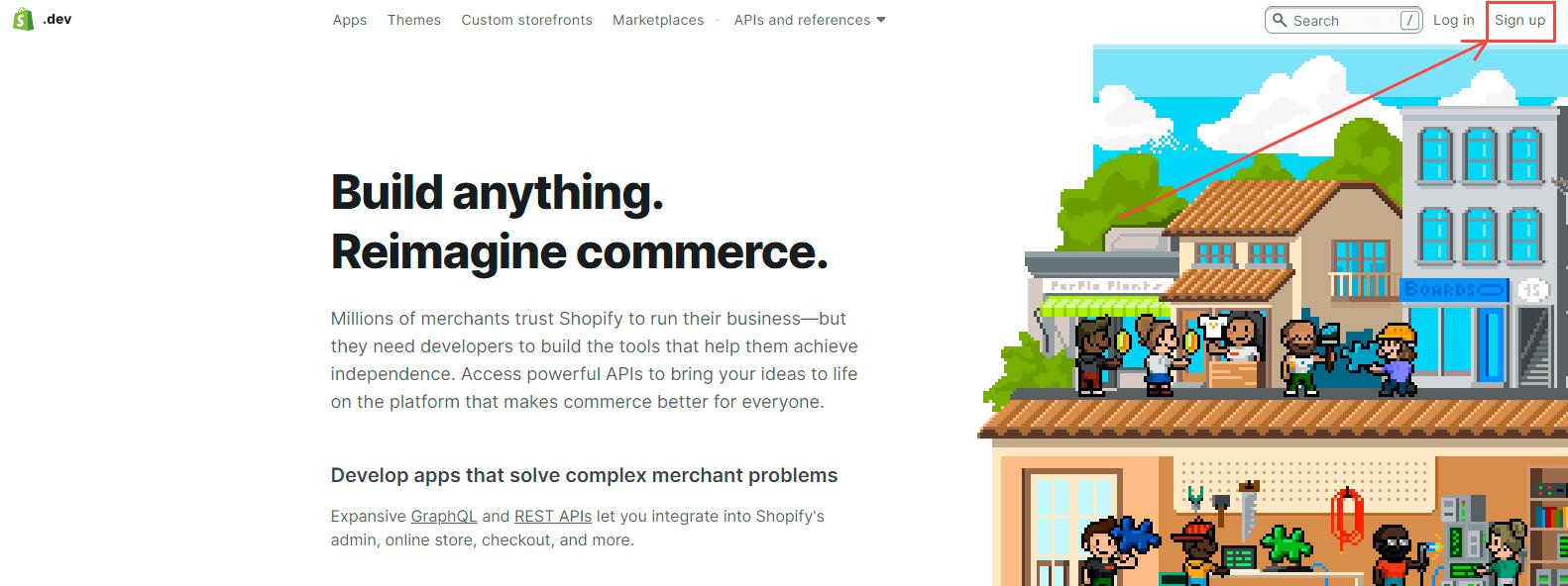
Go to shopify.dev and click Sign up.

Shopify index

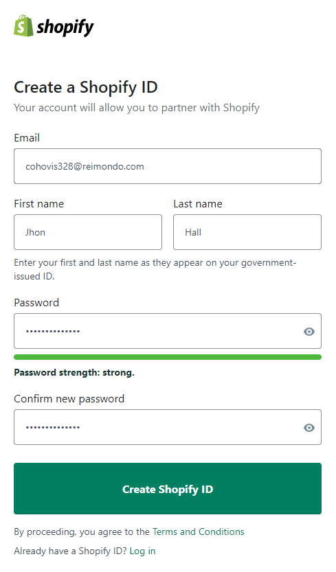
Enter your registration information and click Create Shopify ID.

Shopify signup form

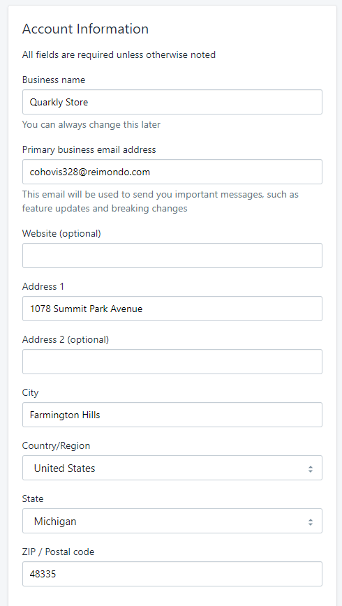
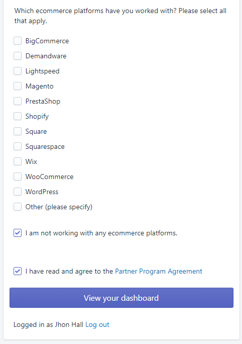
The next step is to enter additional information and click View your dashboard.

Account information Account information

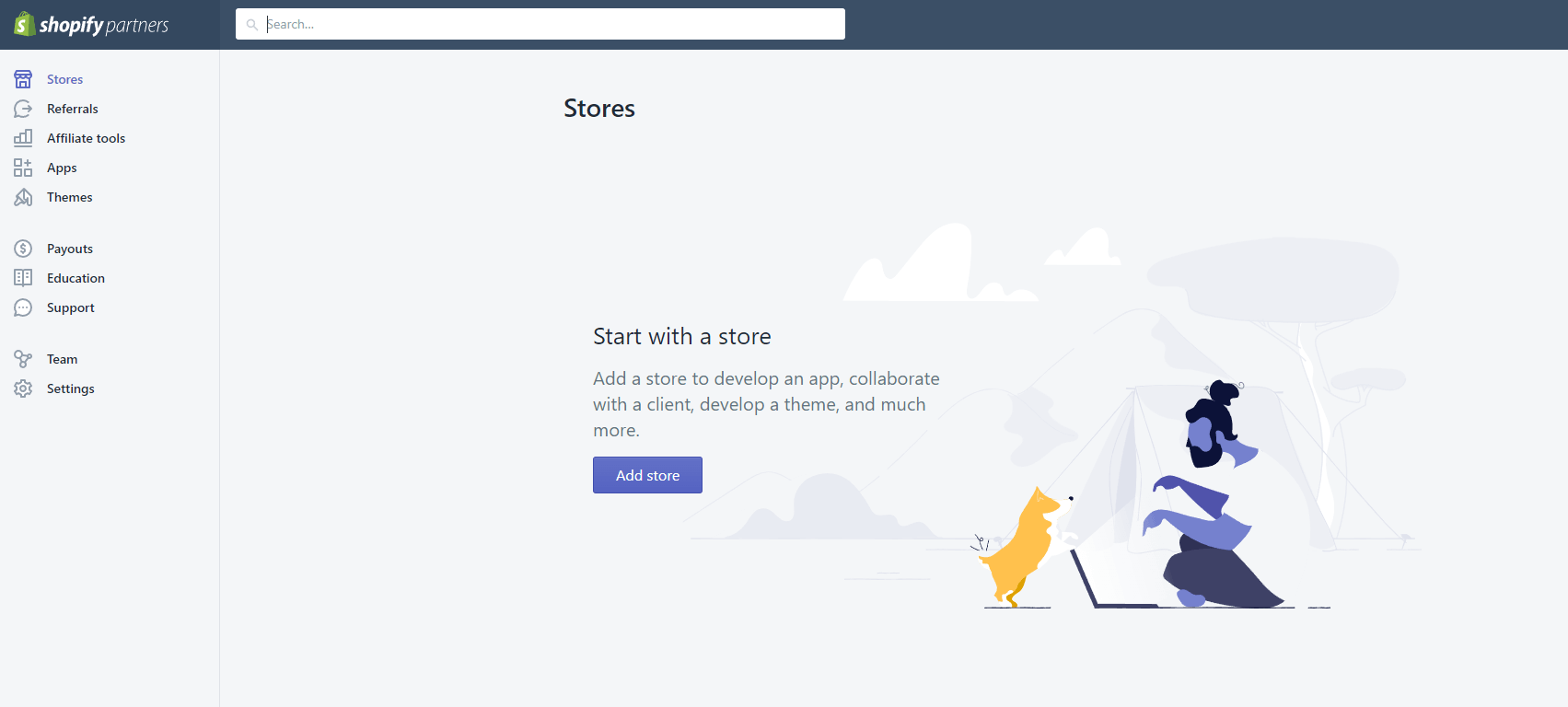
After that, we will get to the Shopify Partners dashboard.

1.2 Creating a Shopify store#

Next, you need to create a Shopify store. Click the Add store button.

Shopify Partners Add Store

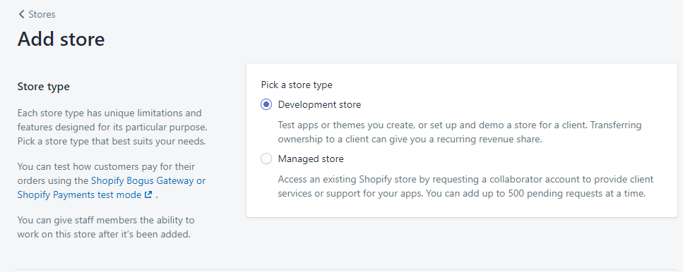
Choose Development store.

Add store options

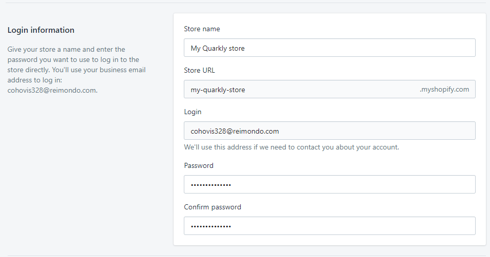
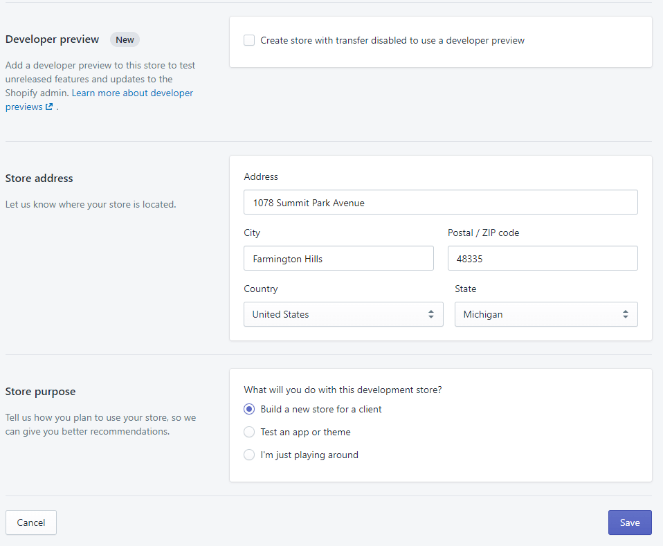
Enter the data to create a store and click Save.

Add store options Add store options

1.3 Getting Storefront API access token#

Go to the Stores tab and select our store.
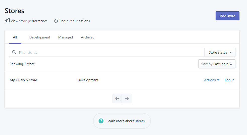
Shopify Stores

Then press Log in.

My Quarkly Store

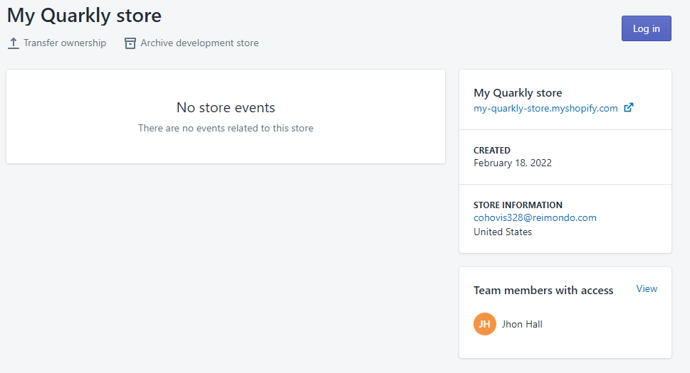
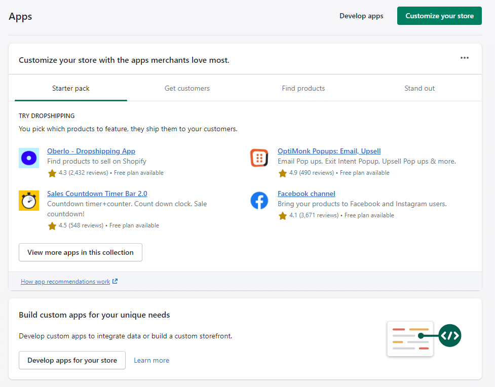
This will bring us to the management page of our store. Select the Apps tab in the left pane.

Store Apps Section

Click Develop apps for your store.

Develop Apps for your Store

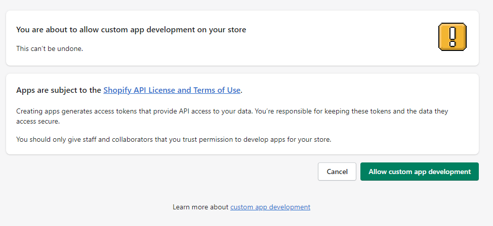
Click Allow custom app development.

Allow Custom App Development Step 1

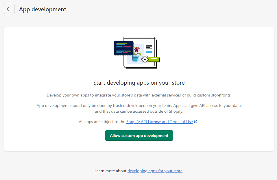
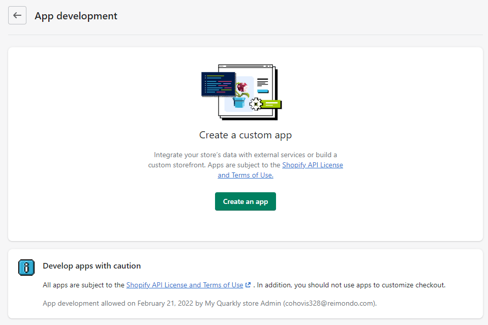
Press Allow custom app development again.

Allow Custom App Development Step 2

Click Create an app.

Create an App

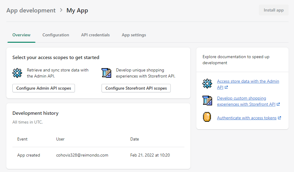
Enter the name of the application and click Create app.

Create an App Form

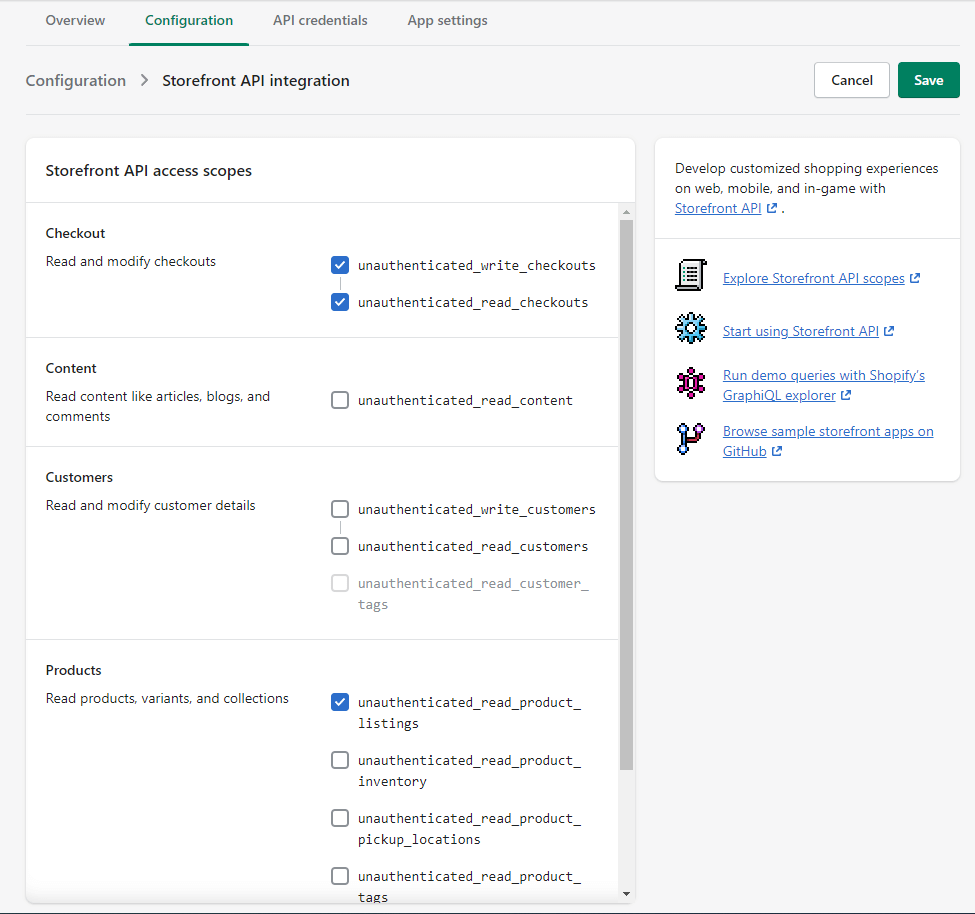
After creating the application, you need to configure the scopes. Click Configure Storefront API scopes.

My App Settings Overview

For our example, these settings are necessary:

  • unauthenticated_write_checkouts
  • unauthenticated_read_checkouts
  • unauthenticated_read_product_listings

My App Configaration

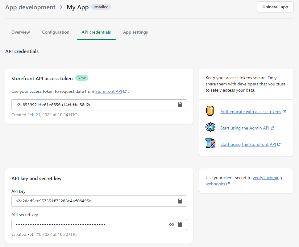
Then go to the API credentials tab and click Install app.
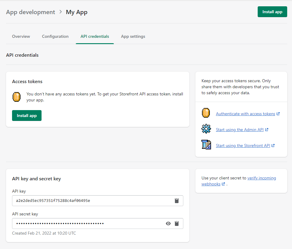
My App Storefront API configuration

Confirm our action.

My App Storefront API configuration

We got the Storefront API access token, which we will need later on.

Storefront API Access Token

1.4 Adding items to the store#

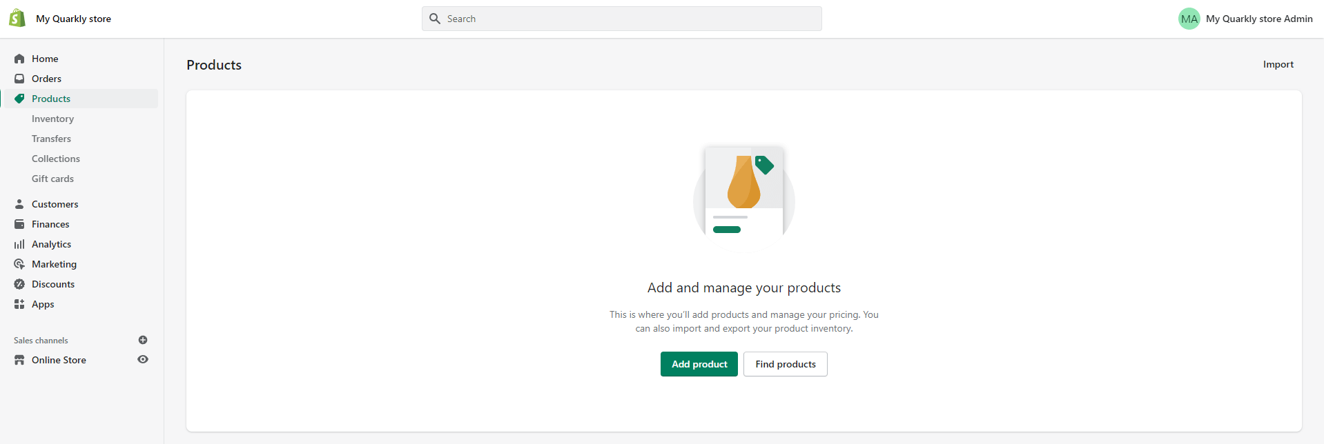
In the store, select the Products tab and then click Add product.

My Store Products

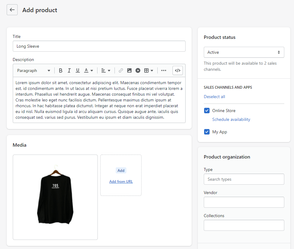
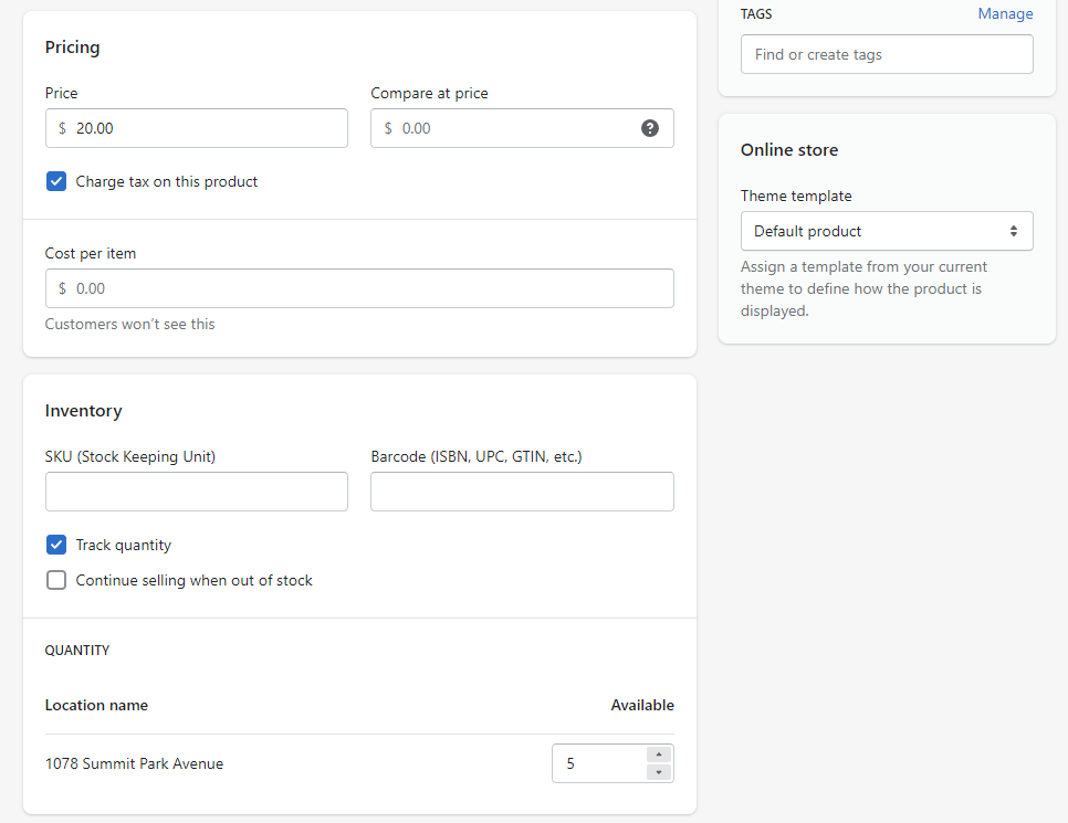
Enter Title, Description, add Media, configure Pricing and Inventory. In Product status select Active.

Add Product

Add Product

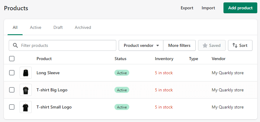
After adding a few products will look something like this:

Products List

2 Creating a project in Quarkly#

Create an empty project in Quarkly.

2.1 ReduxStore component (module)#

Create a component called ReduxStore. This will be a module with redux storage. Read more about redux: https://redux.js.org/introduction/getting-started

Copy the code below and paste it into our component. Change

  • STOREFRONT_ACCESS_TOKEN to Storefront API access token, which we obtained in step 1.3
  • DOMAIN - the domain of our Shopify store (ends in .myshopify.com)
// Import redux
import { configureStore, createSlice } from '@reduxjs/toolkit';
import { persistReducer } from 'redux-persist';
import storage from 'redux-persist/lib/storage';
// Import shopify-buy to work with Storefront
import Client from 'shopify-buy';
// Initializing a client
const client = Client.buildClient({
storefrontAccessToken: 'STOREFRONT_ACCESS_TOKEN',
domain: 'my-quarkly-store.myshopify.com',
});
// First, define the reducer and action creators via `createSlice`
const appSlice = createSlice({
name: 'app',
initialState: {
checkout: { lineItems: [] },
products: [],
},
reducers: {
setCheckout: (state, action) => {
state.checkout = action.payload;
},
setProducts: (state, action) => {
state.products = action.payload;
},
},
});
// Destructure the plain action creators
const { setCheckout, setProducts } = appSlice.actions;
export const createCheckout = () => async (dispatch) => {
const response = await client.checkout.create();
dispatch(setCheckout(response));
};
export const fetchProducts = () => async (dispatch) => {
const response = await client.product.fetchAll();
dispatch(setProducts(response));
};
export const addVariantToCart = (checkoutId, lineItemsToAdd) => async (
dispatch
) => {
const response = await client.checkout.addLineItems(
checkoutId,
lineItemsToAdd
);
dispatch(setCheckout(response));
};
export const clearCheckout = (checkoutId, lineItems) => async (dispatch) => {
const response = await client.checkout.removeLineItems(
checkoutId,
lineItems
);
dispatch(setCheckout(response));
};
export const updateLineItems = (checkoutId, lineItems) => async (dispatch) => {
const response = await client.checkout.updateLineItems(
checkoutId,
lineItems
);
dispatch(setCheckout(response));
};
// Settings for redux-persist
const persistConfig = {
key: 'root',
// A unique string (necessary to work correctly in preview mode on quarkly)
keyPrefix: 'my-quarkly-shopify-app:',
version: 1,
// Save only the shopping cart
whitelist: ['checkout'],
storage,
};
const persistedReducer = persistReducer(persistConfig, appSlice.reducer);
export default configureStore({
reducer: persistedReducer,
});

2.2 App component#

Create a component called App. It will contain the provider for the redux store.

Copy the code below and paste it into our component.

import React, { useEffect } from 'react';
import { Box } from '@quarkly/widgets';
import { useSelector, useDispatch, Provider } from 'react-redux';
import { persistStore } from 'redux-persist';
import { PersistGate } from 'redux-persist/integration/react';
import store, { createCheckout } from './ReduxStore';
const persistor = persistStore(store);
const App = ({ children, ...props }) => {
const checkoutId = useSelector((state) => state.checkout?.id);
const dispatch = useDispatch();
// If there is no cart, let's create one.
useEffect(() => {
if (!checkoutId) dispatch(createCheckout());
}, []);
return <Box {...props}>{children}</Box>;
};
// Wrap our App component in a redux Provider and PersistGate
const WrappedApp = (props) => (
<Provider store={store}>
<PersistGate loading={null} persistor={persistor}>
<App {...props} />
</PersistGate>
</Provider>
);
export default Object.assign(WrappedApp, {
title: 'App',
propInfo: {}
});"

2.3 Product component#

Create a component called Product. This will be a product card.

Copy the code below and paste it into our component.

import React, { useState, useContext } from 'react';
import { useOverrides, Override } from '@quarkly/components';
import { Box, Image, Button, Input } from '@quarkly/widgets';
import QuarklycommunityKitPopup, {
PopupContext,
} from '@quarkly/community-kit/Popup';
import { useSelector, useDispatch } from 'react-redux';
import { addVariantToCart } from './ReduxStore';
// Object with overrides
// Read more about overrides: https://developers.quarkly.io/components/overrides/overview
const overrides = {
'Product Image Wrapper': {
kind: 'Box'
},
'Product Image': {
kind: 'Image',
props: {
'max-height': '200px',
width: '100%',
'object-fit': 'cover',
},
},
'Product Title': {
kind: 'Box',
props: {
font: '--headline2',
margin: '20px 0px 20px 0px',
},
},
'Product Price': {
kind: 'Box',
props: {
margin: '20px 0px 20px 0px',
}
},
'Product Popup': {
kind: 'QuarklycommunityKitPopup',
},
'Popup Product Title': {
kind: 'Box',
props: {
font: '--headline2',
margin: '20px 0px 20px 0px',
},
},
'Popup Product Description': {
kind: 'Box',
props: {
margin: '20px 0px 20px 0px',
}
},
'Popup Product Price': {
kind: 'Box',
props: {
margin: '20px 0px 20px 0px',
}
},
'Popup Product Quantity': {
kind: 'Input'
},
'Popup Product Image': {
kind: 'Image',
props: {
width: '100%',
},
},
'Popup Product Add button': {
kind: 'Button',
props: {
children: 'Add to cart',
},
},
};
// Component for displaying popup content
const ProductPopupContent = ({ product, children, override }) => {
const dispatch = useDispatch();
const checkout = useSelector((state) => state.checkout);
const [quantity, setQuantity] = useState(1);
const context = useContext(PopupContext);
const onClick = () => {
const checkoutId = checkout.id;
const variantId = product.variants && product.variants[0].id.toString();
const lineItemsToAdd = [{ variantId, quantity }];
dispatch(addVariantToCart(checkoutId, lineItemsToAdd));
context.closePopup();
setQuantity(1);
};
return (
<>
<Box width="100%">
<Image
{...override('Popup Product Image')}
src={product.images?.[0]?.src}
/>
</Box>
<Box width="100%">
<Box {...override('Popup Product Title')}>{product.title}</Box>
<Box {...override('Popup Product Description')}>
{product.description}
</Box>
<Box {...override('Popup Product Price')}>
{`\$ ${product.variants[0].price}`}
</Box>
<Input
{...override('Popup Product Quantity')}
type="number"
min="1"
value={quantity}
onChange={(e) => setQuantity(Number(e.target.value))}
/>
<Button
{...override('Popup Product Add button')}
onClick={onClick}
/>
{children}
</Box>
</>
);
};
// Component for displaying a product card
// Contains a button which, when clicked, will open a Popup
const Product = ({ product, ...props }) => {
const { override, children, rest } = useOverrides(props, overrides);
return (
<Box {...rest}>
<Box {...override('Product Image Wrapper')}>
<Image
{...override('Product Image')}
src={product.images?.[0]?.src}
/>
</Box>
<Box {...override('Product Title')}>{product.title}</Box>
<Box {...override('Product Price')}>
{`\$ ${product.variants[0].price}`}
</Box>
<QuarklycommunityKitPopup {...override('Product Popup')}>
{override('Product Popup').children}
<Override slot="Button Close" box-sizing="content-box" />
<Override
slot="Button Open"
disabled={!product.availableForSale}
/>
<ProductPopupContent
override={override}
product={product}
children={children}
/>
</QuarklycommunityKitPopup>
</Box>
);
};
export default Object.assign(Product, {
title: 'Product',
propInfo: {}
});

2.4 Component Products#

Create a component called Products. This will be a list of products.

Copy the code below and paste it into our component.

import React, { useEffect } from 'react';
import { useSelector, useDispatch } from 'react-redux';
import { useOverrides } from '@quarkly/components';
import { Box } from '@quarkly/widgets';
import { fetchProducts } from './ReduxStore';
import Product from './Product';
// Object with overrides
// Read more about overrides: https://developers.quarkly.io/components/overrides/overview
const overrides = {
Product: {
kind: 'Product',
},
};
// Component for displaying a list of products
const Products = (props) => {
const dispatch = useDispatch();
const products = useSelector((state) => state.products);
const { override, rest } = useOverrides(props, overrides);
useEffect(() => {
dispatch(fetchProducts());
}, []);
return (
<Box {...rest}>
{products &&
products.map((product) => (
<Product
{...override('Product', `Product ${product.id}`)}
product={product}
key={product.id}
/>
))}
</Box>
);
};
export default Object.assign(Products, {
title: 'Products',
overrides,
});

2.5 Cart component#

Create a component called Cart. This will be the cart.

Copy the code below and paste it into our component.

import React from 'react';
import { Text, Box, Button } from '@quarkly/widgets';
import { useSelector, useDispatch } from 'react-redux';
import { useOverrides } from '@quarkly/components';
import { clearCheckout } from './ReduxStore';
import CartItem from './CartItem';
// Object with overrides
// Read more about overrides: https://developers.quarkly.io/components/overrides/overview
const overrides = {
'Cart Text': {
kind: 'Text',
props: {
children: 'Your cart:',
font: '--headline2',
},
},
'Checkout Button': {
kind: 'Button',
props: {
children: 'Checkout',
},
},
'Clear Button': {
kind: 'Button',
props: {
children: 'Clear',
},
},
'Cart Subtotal Text': {
kind: 'Text',
props: {
children: 'Subtotal:',
},
},
'Cart Subtotal': {
kind: 'Box',
},
};
// Component for displaying the shopping cart
const Cart = (props) => {
const { override, rest } = useOverrides(props, overrides);
const checkout = useSelector((state) => state.checkout);
const dispatch = useDispatch();
const onClick = () => {
window.open(checkout.webUrl);
};
const onClearClick = () => {
dispatch(
clearCheckout(
checkout.id,
[...checkout.lineItems].map((x) => x.id)
)
);
};
return (
<Box {...rest}>
<Text {...override('Cart Text')} />
<Box {...override('CartItem List')}>
{checkout.lineItems.map((item) => (
<CartItem
{...override('CartItem', `CartItem ${item.id}`)}
item={item}
key={item.id}
/>
))}
</Box>
<Text {...override('Cart Subtotal Text')} />
<Box {...override('Cart Subtotal')}>
{`\$ ${checkout.subtotalPrice}`}
</Box>
<Box>
<Button {...override('Checkout Button')} onClick={onClick} />
<Button {...override('Clear Button')} onClick={onClearClick} />
</Box>
</Box>
);
};
export default Object.assign(Cart, {
title: 'Cart',
overrides,
});

2.6 CartItem component#

Create a component called CartItem. This is the component for displaying the item in the cart.

Copy the code below and paste it into our component.

import React, { useState, useEffect } from 'react';
import { Box, Input, Image, Button, Icon } from '@quarkly/widgets';
import { useSelector, useDispatch } from 'react-redux';
import { useOverrides } from '@quarkly/components';
import { clearCheckout, updateLineItems } from './ReduxStore';
// Object with overrides
// Read more about overrides: https://developers.quarkly.io/components/overrides/overview
const overrides = {
'CartItem Image': {
kind: 'Image',
props: {
height: '100%',
},
},
'CartItem Clear Button': {
kind: 'Button',
},
'CartItem Clear Button Icon': {
kind: 'Icon',
},
};
// Hook useDebounce
// This hook allows you to debounce any fast changing value
function useDebounce(value, delay) {
const [debouncedValue, setDebouncedValue] = useState(value);
useEffect(() => {
const handler = setTimeout(() => {
setDebouncedValue(value);
}, delay);
return () => {
clearTimeout(handler);
};
}, [value, delay]);
return debouncedValue;
}
// Component for displaying an item in the cart
// Contains a text field for changing the quantity of an item
const CartItem = ({ item, ...props }) => {
const { override, rest } = useOverrides(props, overrides);
const checkout = useSelector((state) => state.checkout);
const dispatch = useDispatch();
const [localQuantity, setLocalQuantity] = useState(item.quantity);
const debouncedQuantity = useDebounce(localQuantity, 1000);
const onClick = () => {
dispatch(clearCheckout(checkout.id, [item.id]));
};
useEffect(() => {
setLocalQuantity(item.quantity);
}, [item.quantity]);
useEffect(() => {
dispatch(
updateLineItems(checkout.id, [
{ id: item.id, quantity: debouncedQuantity },
])
);
}, [debouncedQuantity]);
const onQuantityChange = (e) => {
setLocalQuantity(parseInt(e.target.value));
};
return (
<Box {...rest}>
<Box>
<Image
{...override('CartItem Image')}
src={item.variant?.image?.src}
/>
</Box>
<Box {...override('CartItem Text Wrapper')}>
<Box {...override('CartItem Text')}>
{item.title}
</Box>
</Box>
<Box {...override('CartItem Quantity Wrapper')}>
<Input
{...override('CartItem Quantity')}
type="number"
min="1"
value={localQuantity}
onChange={onQuantityChange}
/>
</Box>
<Box {...override('CartItem Clear Button Wrapper')}>
<Button
{...override('CartItem Clear Button')}
onClick={onClick}
>
{override('CartItem Clear Button').children}
<Icon
{...override(
'CartItem Clear Button Icon',
`CartItem Clear Button Icon ${item.id}`
)}
/>
</Button>
</Box>
</Box>
);
};
export default Object.assign(CartItem, {
title: 'CartItem',
overrides,
propInfo: {},
});

2.7 CartBadge component#

Create a component called CartBadge. This is a component for displaying the number of items in the cart.

Copy the code below and paste it into our component.

import React from 'react';
import { Box } from '@quarkly/widgets';
import { useSelector } from 'react-redux';
import { useOverrides } from '@quarkly/components';
const overrides = {
Badge: {
kind: 'Box',
props: {
position: 'absolute',
background: '--color-primary',
right: '-15px',
top: '-15px',
'border-radius': '10px',
'min-width': '20px',
'min-height': '20px',
padding: '1px 6px 1px 6px',
font: '16px --fontFamily-mono',
color: '--light',
transition:
'all --transitionDuration-fastest --transitionTimingFunction-sharp 0s',
},
},
'Badge Hide': {
kind: 'Box',
props: {
transform: 'scale(0)',
},
},
};
// Component for displaying the number of items in the cart
const CartBadge = (props) => {
const count = useSelector((state) =>
state.checkout.lineItems.reduce((acc, value) => acc + value.quantity, 0)
);
const { override, children, rest } = useOverrides(props, overrides);
return (
<Box {...rest}>
<Box {...override('Badge', count === 0 && 'Badge Hide')}>
{count !== 0 && count}
</Box>
{children}
</Box>
);
};
export default Object.assign(CartBadge, {
title: 'CartBadge',
overrides,
propInfo: {},
defaultProps: {
position: 'relative',
},
});

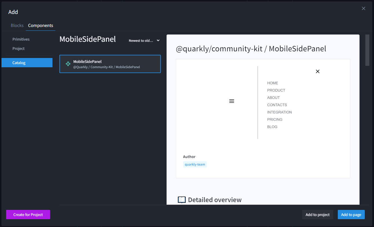
2.8 Adding a MobileSidePanel component from the catalog#

Add a MobileSidePanel component from the catalog.

MobileSidePanel Component

2.9 Creating the Index Page#

Copy the code below and paste it into our page.

<Components.App>
<Section>
<Box
display="flex"
padding="12px 0"
justify-content="space-between"
align-items="center"
flex-direction="row"
>
<Text margin="0" md-margin="0px 0 20px 0" text-align="left" font="--lead">
My Quarkly Store
</Text>
<Box>
<Components.CartBadge>
<Components.QuarklycommunityKitMobileSidePanel breakpoint="all" sm-position="static">
<Override slot="Button Text" display="none" />
<Override slot="Button Icon" size="36px" />
<Override slot="Button Icon :closed" category="fi" icon="FiShoppingCart" />
<Override
slot="Content"
width="600px"
sm-top="100px"
sm-left="0px"
sm-width="100%"
md-width="80vw"
lg-width="60vw"
/>
<Override slot="Button" />
<Components.Cart>
<Override slot="Cart Text">
Shopping cart
</Override>
<Override slot="CartItem" height="100px" display="flex">
<Override slot="CartItem Clear Button Icon" category="fa" icon="FaRegTrashAlt" size="24px" />
<Override slot="CartItem Quantity" display="block" />
<Override slot="CartItem Quantity Wrapper" align-content="center" margin="auto auto auto auto" />
<Override slot="CartItem Clear Button Wrapper" margin="auto auto auto auto" />
<Override slot="CartItem Text Wrapper" margin="auto auto auto auto" />
</Override>
<Override slot="CartItem List" margin="20px 0px 20px 0px" />
<Override slot="Cart Subtotal Text" font="--headline3" />
<Override slot="Cart Subtotal" font="--lead" />
</Components.Cart>
</Components.QuarklycommunityKitMobileSidePanel>
</Components.CartBadge>
</Box>
</Box>
</Section>
<Components.Products
display="grid"
grid-template-columns="repeat(4, 1fr)"
padding="50px 50px 50px 50px"
lg-grid-template-columns="repeat(3, 1fr)"
md-grid-template-columns="repeat(2, 1fr)"
sm-grid-template-columns="1fr"
>
<Override slot="Product" padding="20px 20px 20px 20px">
<Override slot="Product Image" min-width="100%" />
<Override slot="Product Popup">
<Override slot="Button Close" />
<Override slot="Content" padding="20px 20px 20px 20px" flex-direction="row" display="flex" />
<Override slot="Button Open" disabled={false} width="100%">
Read more
</Override>
<Override slot="Wrapper" width="50vw" min-height="50vh" />
</Override>
<Override slot="Popup Product Title" margin="20px 0px 20px 0px" />
</Override>
</Components.Products>
</Components.App>