Structure

Detailed overview#
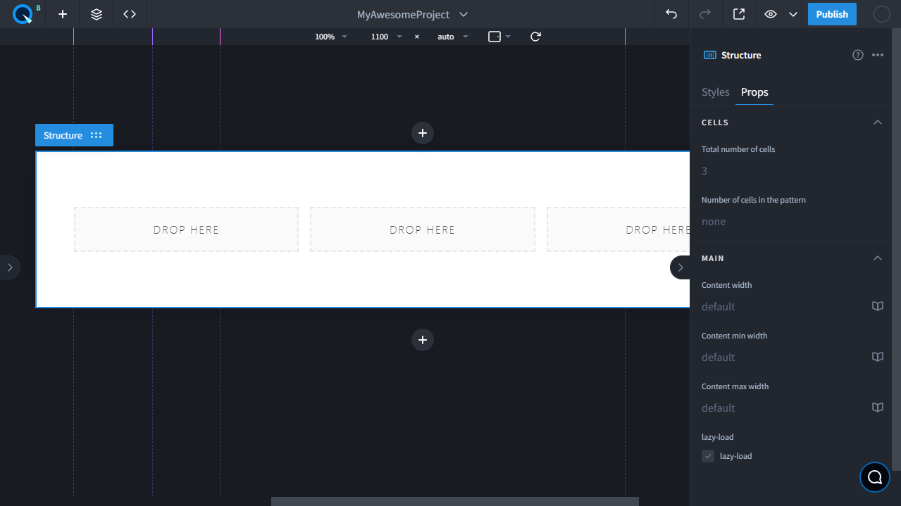
Structure is a component for forming a block with content. Unlike Section, here you can form an internal structure from cells. Structure consists of an external and internal containers for other widgets. For the inner container, you can specify the maximum and minimum width, as well as the number of cells for the content and the number of unique cells in the pattern. The cell behavior is configured in the Layout section by the Grid properties of a StructureContent component. The cells themselves can be styled using the properties of the Grid Child section.
About the Pattern#
Pattern is a group of different repeated cells. For example, you can make a pattern of two cells with different styling and if the total number is 8, then the odd part will be styled like the first cell, and the even part like the second cell. This is designed so to create interesting structure and content design solutions.
Available props#
| Prop name | Description |
|---|---|
| Total number of cells | Total number of cells |
| Number of cells in the pattern | Number of cells in the pattern |
| Content width | Width of content area |
| Content min width | Minimum width of content area |
| Content max width | Maximum width of content area |
| lazy-load | Enables block loading as the page scrolls |