Day 7. Adaptive design
About breakpoints#
With breakpoints, you can adapt the site design for different devices and screen resolutions.
- You can switch breakpoints in two ways:
By using the slider on the right side of your page.
By using the switch at the top of the builder.
By clicking on the corresponding breakpoint area at the top of the builder.
- Set styles on breakpoints
Once you get to one of the breakpoints, you can change the CSS properties. The changes will be applied just to this breakpoint where we are. These changes will also apply to lower breakpoints, unless another individual property is set. And let's change the design of the card for different breakpoints.
Change styles to md#
Title font size
Go to breakpoint md; different breakpoints have their own color scheme.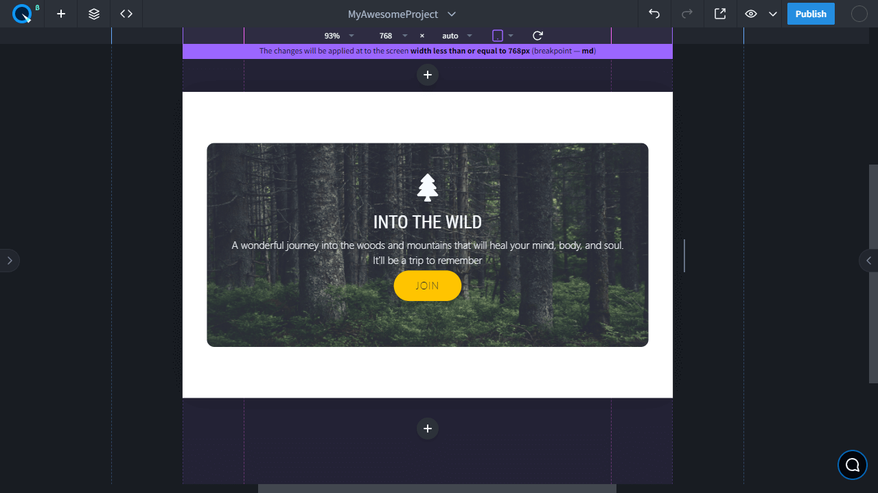
This is the same color as the value that changes in the property. Let's select the card title and change its font size.
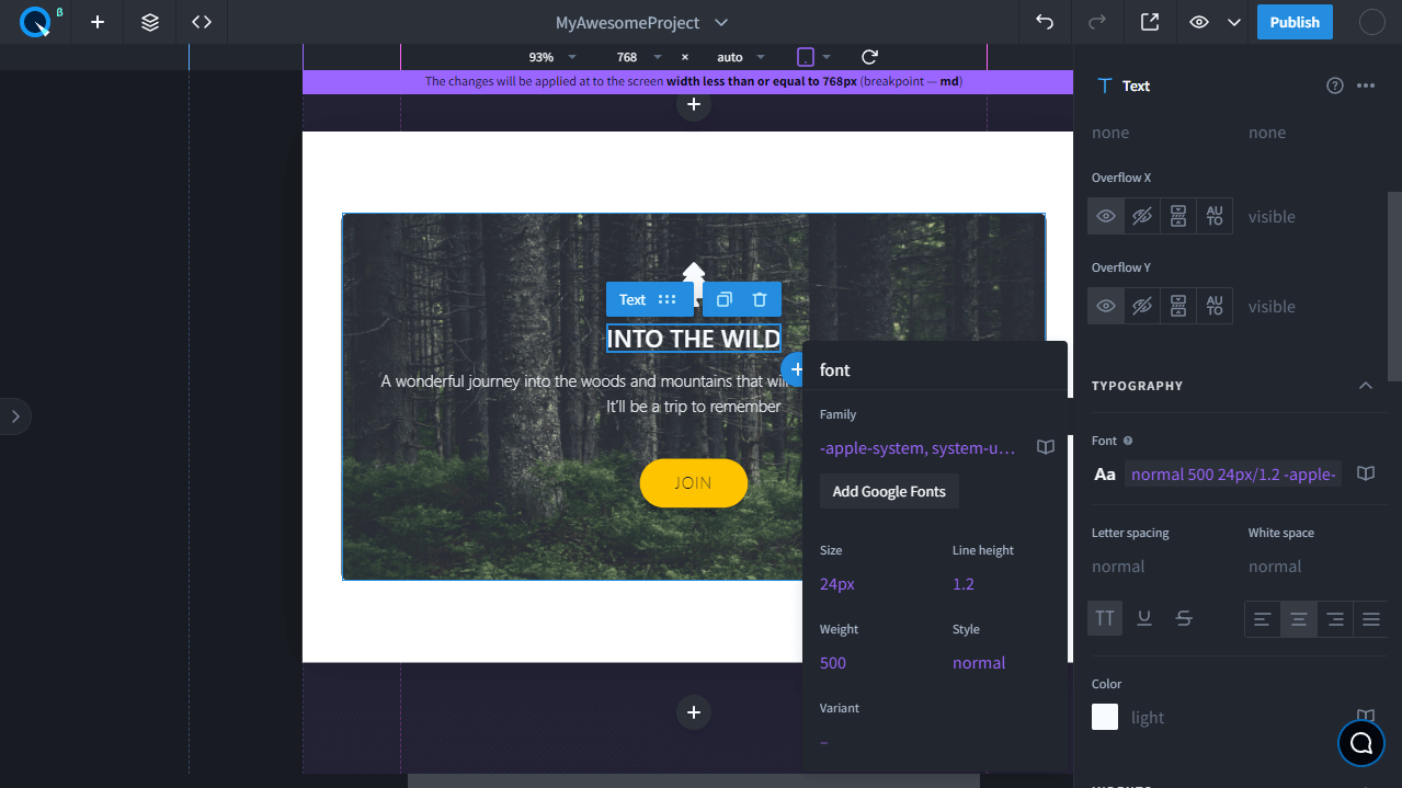
The new value color has become the same as the color of the breakpoint on which it's active.
The button font size and the indents
Change the font size and slightly reduce the indentation in the button.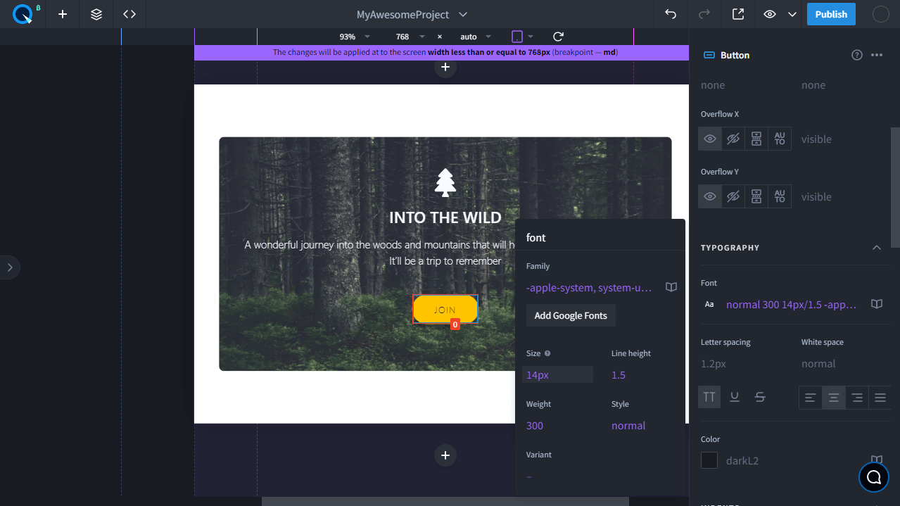
And as we said earlier, these CSS properties are also applied to the breakpoints below.
Change styles to sm#
Title font size
Go to sm breakpoint and select the card title that we've already changed. The same settings that we specified for breakpoint md were applied here. Let's apply individual settings to this breakpoint and make the title even smaller.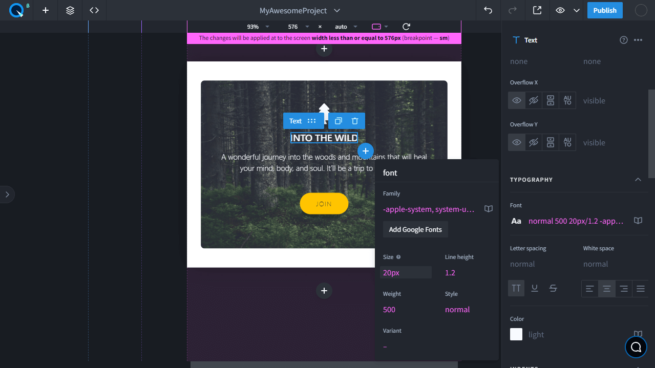
Button font size and indents
Here we also change the size and indents individually.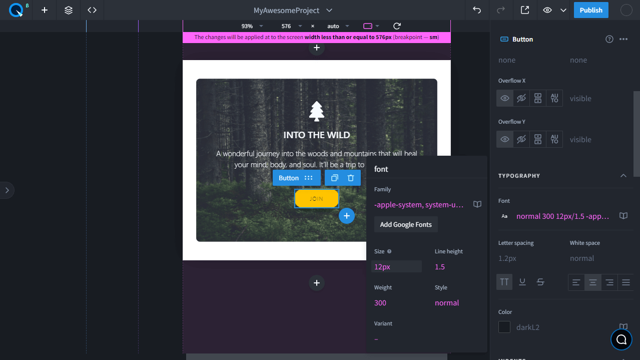
Adding and editing#
Add a new breakpoint
You can also create custom breakpoints. To do that, go to the Theme section and click on the "+" icon next to the breakpoints section.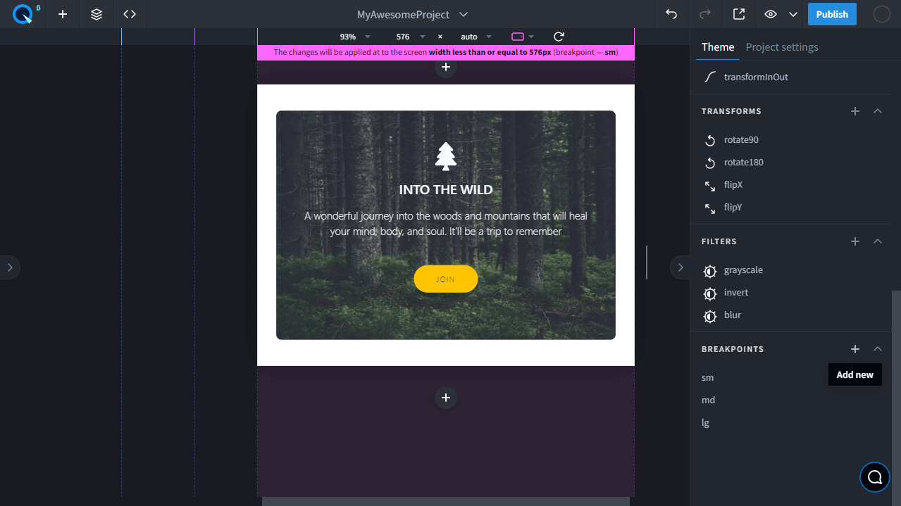
After that, name the breakpoint and specify a minimum or maximum width.
- If you select the minimum width, the breakpoint will be active when the screen is the same as or greater than the specified width.
- If you select the maximum width, the breakpoint will be active up to the specified width.
Edit existing breakpoints
You can edit existing breakpoints by simply clicking on one and setting the width you want. For example, select the lg breakpoint and increase its width to 1200px.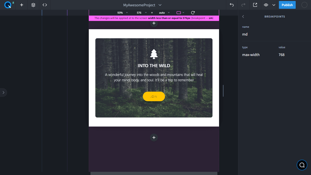
Inheritance in Desktop First and Mobile First
By default, all lower breakpoints inherit the styles of higher breakpoints. This approach is called Desktop First. There's another approach — Mobile First, where the design is made for mobile devices first, and the higher breakpoints inherit the lower breakpoints' design. To change the default breakpoints from Desktop First to Mobile First, change max-width to min-width in all breakpoints.