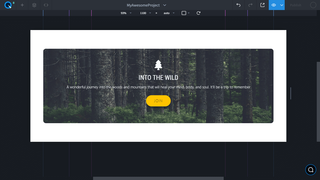
Day 4. How to Create a Card
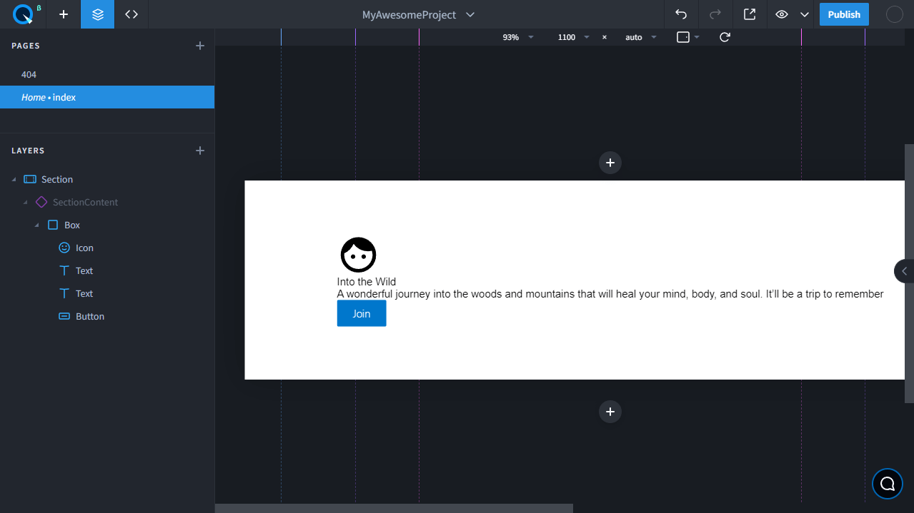
Add elements to the page#
Add a Box first, and inside it add the following one by one:
- Icon
- Text
- One more Text
- Button
Change the text as shown in the example#
Set background#
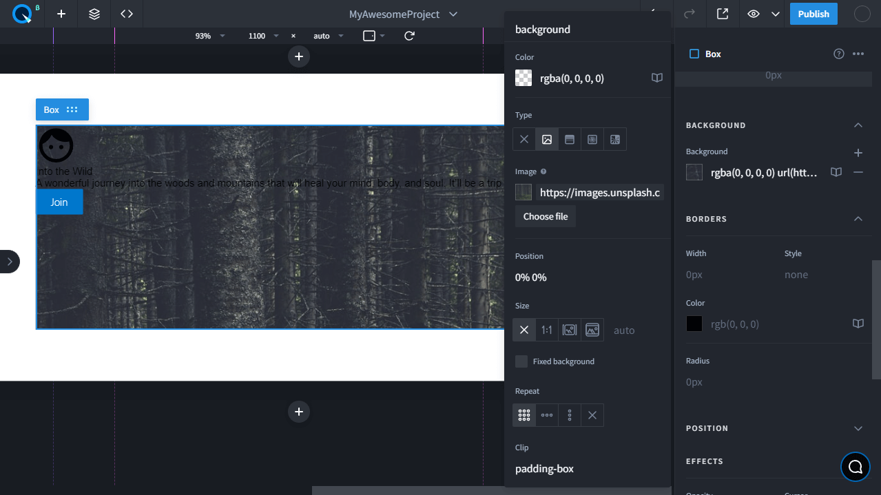
- On the panel, select Box by clicking on it and holding
CTRLor⌘for MacOS. - Navigate to the Styles > Layout tab on the Props panel and set the width to 100% and the height to 320px.
- Now go to Backgrounds, click in the input field to open the panel, choose Type URL, and copy-paste this image URL:
https://images.unsplash.com/photo-1593431074633-21ef64707d29?fit=crop&w=1200&q=80
Style the text and icon#
- Select the text and set the styles like in the example. Change its color and font.
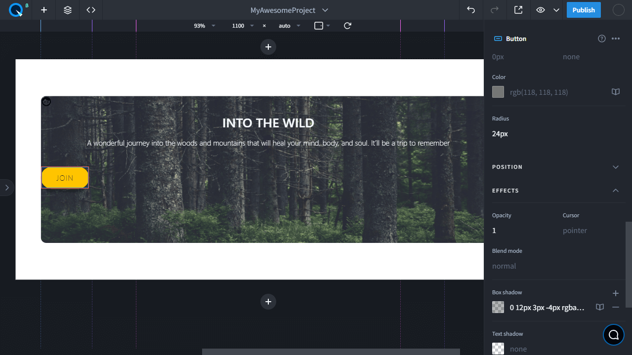
- Select the button and style it like in the example. Change the background color, text color, and round corners.
- Add the shadow for the button. To do this, open the Effects tab and use the Box shadow property.
- Open the Indents tab. Specify margin 24px for the top field, padding 34px for the sides, and 12px for the top and bottom fields.
Change the font#
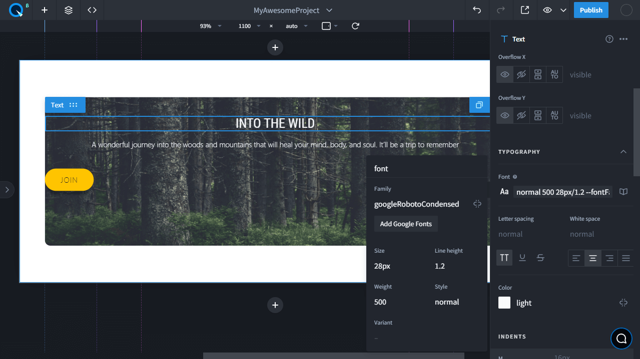
- Select the heading. On the Styles panel, go to the Typography tab and click on the icon to remove the link to the value from the Theme. Now add the new font to the project. To do this, click on the font value to open the panel. On the panel, click on the Add Google fonts button.
- In the modal window, search for Open Sans Condensed. Click on it and close the window. Now the new font has been added to the project.
- Now choose the new font for the heading. Open the panel with the font settings and choose googleOpenSansCondenced for the Family field.
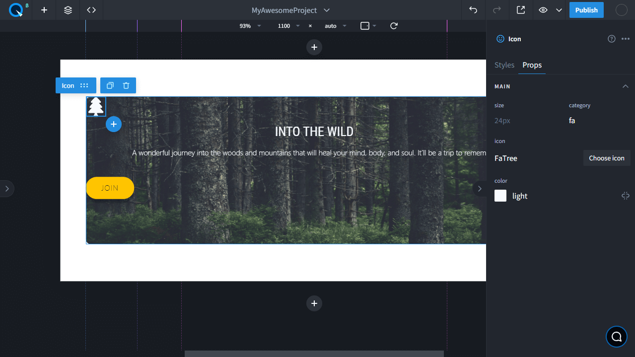
Change the icon#
- To change the icon, double-click it. A modal window featuring all icons will appear. Choose the Font Awesome category and enter "tree" into the search bar. Click on the icon

- Style the icon color and size according to the example.
Center elements#
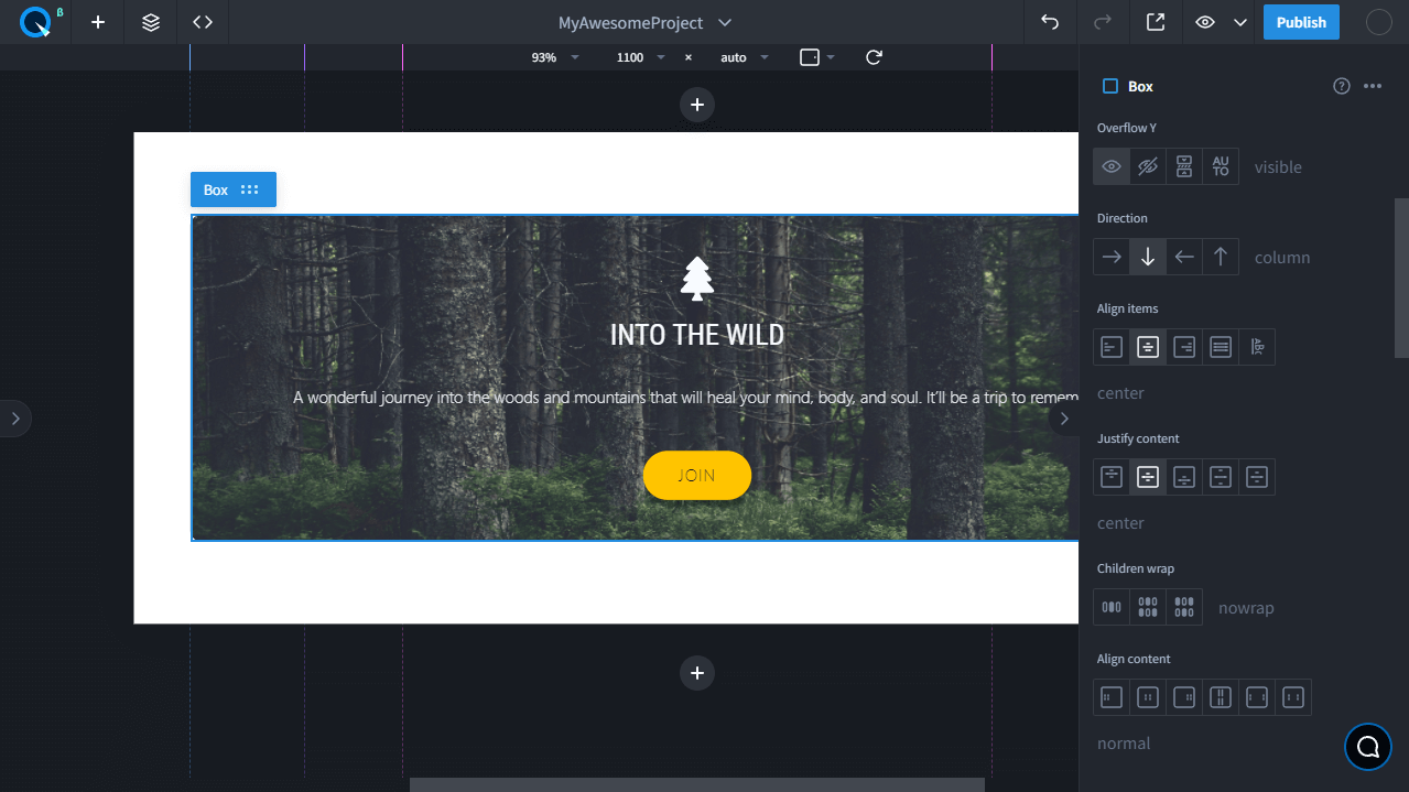
By default, the content is left-aligned. Change this to a center-aligned Box with the help of display flex.
- Select Box on the page and open the Layouts tab on the Styles panel. Choose the flex value for the display property. This means that Box will use flexbox — the more convenient way to align elements.
- Once you've chosen the flex value for display, new properties will appear under Layout. Search for Direction and choose the column value.
- Choose the center value for Align items and Justify content properties.
Add paddings#
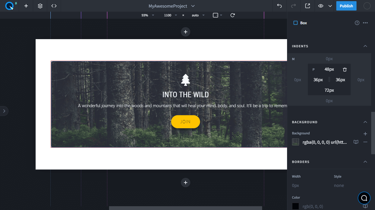
By default, Box doesn't have paddings. Let's add them to make our card more attractive.
Select Box on the page and open the Indents tab. Specify 48px for the top field, 36px for the sides, and 72px for the bottom field.