Day 13. React.js Components
About React.js#
Custom React.js components extend the builder capabilities. They simplify and speed up design creation because they contain ready-made styles, content, and logics. In addition, components can be nested in other components.
About components#
You can import components into other components: primitives, catalog components, custom components, and packages from npm. Here you can program any logic, fetch data, and send it via API.
You can make subcomponents so that they can be selected and styled on the panel. In Quarkly, you can also display the props of a component on the right panel as controls.
How to create a custom component#
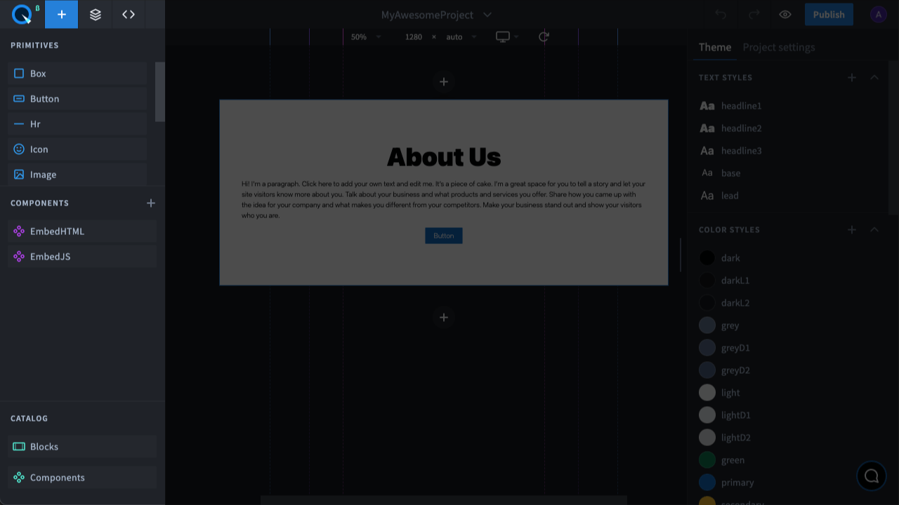
On the Adding panel in the Components section, you can find all your components:
- added from elements to the page
- added from the catalog
- custom components
To create a code component, click on the "+" icon. A window will open for you to enter the component name. After entering the name, a component with default code is created. You can edit it if needed.
How to import primitives#
You need to add an import line at the beginning of the file. For example, this is how you can
How to import a custom React.js component#
This way you can nest a previously created component, such as MyComponent, inside another component:
Importing a module from NPM#
You can also import any package from npm, such as react-particles-js:
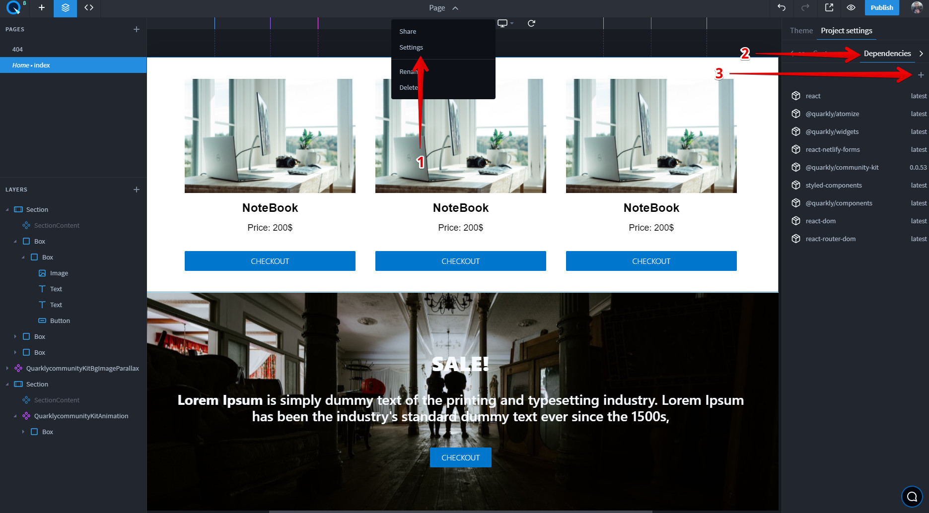
Connected dependencies#
You can add the version you want in your project settings under Dependencies:
Displaying props on the right panel as controls#
To add/configure component parameters, create the propInfo object where the properties are the names of the parameters and the values are their descriptions. For example:
Read more about what types of controls you can use.
How to make subcomponents selectable and stylable (Overrides)#
Overrides allow you to select nested subcomponents on the layers, and change their styles and props in the builder or directly in the component code. To do this, follow the steps below:
- Import the useOverrides hook from the @quarkly/components library
- Create an Override List
- Use Overrides in a Component
- Export a Component with Overrides
Read more about how to work with overrides.
You can find full info about how to work with components in the guide for developers.
Congratulations! You've covered all Quarkly basics.