
Integration with Airtable

Let's create a website to show how data from Airtable is displayed

1. Configuring Airtable#

1.1 Create Workspace and Database#

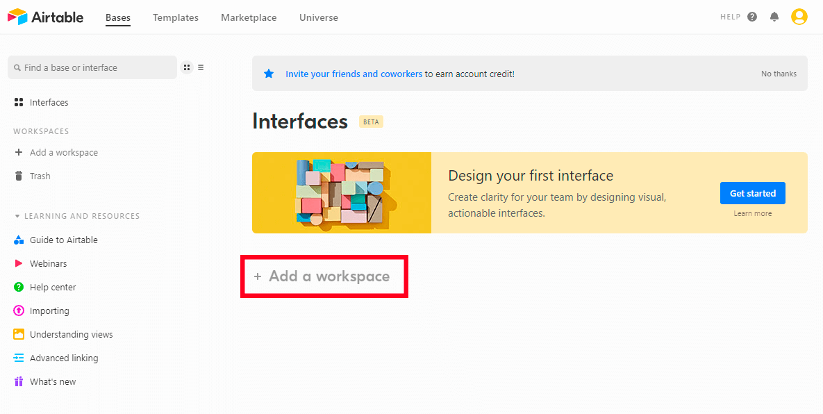
Open airtable.com. Find the “Add workspace” button and click it

Add a workspace

You will see a modal window: "Are you sure you want to create a new workspace?". Click "Create workspace".

Confirm Button

Workspace 1 is created now:

Find the “Add a base” button. Create and automatically open the new Database by clicking this button. The result looks like this:

Empty Base

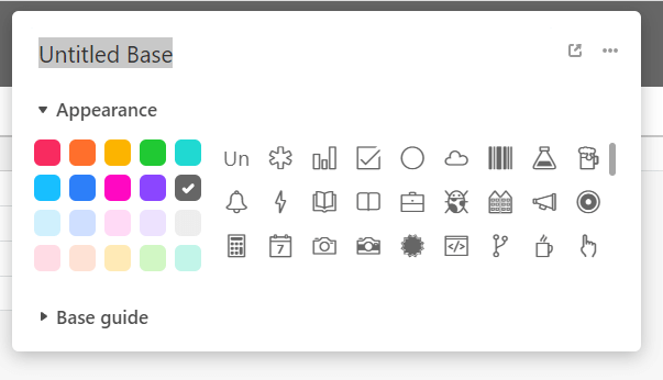
The name of the Database is at the top center of the interface. Just click to change it:

Create Table

1.2 Create view of a table#

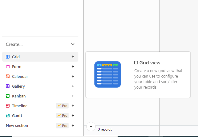
Find the left panel of the interface and the “Create...” category on it. Find “Grid”, click it and change the name of a view, set the access settings to edit a view. Now click the “Create new view” button. You will see a new view on the left panel:

Create New View

New View

1.3 Filling in data#

note

💡 Please note that that the first column in all views is a primary field. That’s why this column can’t be moved or hidden.

Filling in data is a pretty simple process: just double-click a cell in a table then fill in data. In case you need to edit a table or a view - just double-click a title of a column.

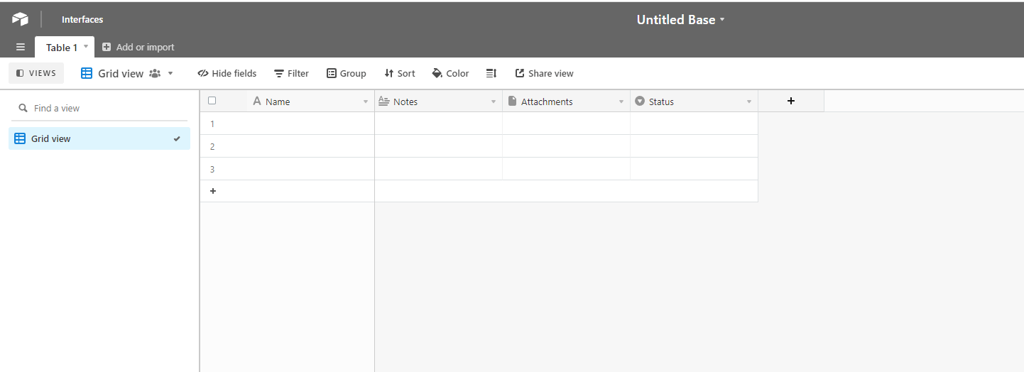
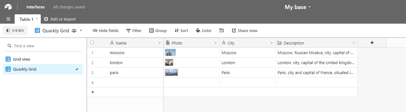
After the filling in data process is finished a table should look like this:

Filled Table

2. Create a project in Quarkly#

Create an empty project.

2.1 Creating components#

2.1.1 Create ComponentNotice#

Create "ComponentNotice" in Quarkly. This will be a component with error messages displayed Copy the below code and paste it into the component

import React from 'react';
import { Box } from '@quarkly/widgets';
// A component with error messages displayed
const ComponentNotice = ({ message, ...props }) => (
<Box
padding="16px"
width="100%"
font="--font-base"
font-style="italic"
color="--color-grey"
background-color="--color-light"
border="1px dashed --color-lightD2"
box-sizing="border-box"
{...props}
>
{message || 'Some Text'}
</Box>
);
Object.assign(ComponentNotice, {
propInfo: {
message: {
title: 'Message',
control: 'input',
type: 'text',
weight: 1,
},
},
})
export default ComponentNotice;

2.1.2 Create an AirTableData component (module)#

Create an AirTableData component in Quarkly. This will be a module with a function for requesting data from Airtable.

Copy the below code and paste it into the component.

const getOptionFields = (fields) => {
return fields
.split(',')
.filter(field => field.trim())
.reduce((res, field) => {
return `${res}&fields[]=${field.trim()}`;
}, '');
}
const getOptionSort = (sort) => {
const fields = sort.fields.split(',').reverse();
const directions = sort.directions.split(',').reverse();
return fields
.filter(field => field)
.reduce((res, _, index) => {
const field = `sort[${index}][field]=${fields[index]}`;
const direction = `sort[${index}][direction]=${directions[index] || directions[directions.length - 1]
}`;
return `${res}&${field}&${direction}`;
}, '');
}
// Function for getting request options
const getOption = (opt, key) => {
let option;
switch (key) {
case 'fields':
option = getOptionFields(opt);
break;
case 'sort':
option = getOptionSort(opt);
break;
default:
option = `&${key}=${opt}`;
}
return option;
}
// Function for getting data from API Airtable
const getData = ({
apiKey,
base,
table,
options,
onRecords,
onError,
}) => {
if (!apiKey || !base) {
onError(new Error('API Key and Base ID required'));
return
}
const query = Object.keys(options).reduce((res, key) => {
const option = getOption(options[key], key);
return options[key] ? `${res}${option}` : res;
}, `api_key=${apiKey}`);
const url = `https://api.airtable.com/v0/${base}/${table}?${query}`;
fetch(encodeURI(url))
.then(res => res.json())
.then(({ records, error }) => {
if (error) {
if (error === 'NOT_FOUND') {
onError(new Error('Base not found'));
return;
}
onError(error);
return;
}
onRecords(records);
});
};
export default getData;
note

⚠️ AirTableData does not need to be added to the page.

2.1.3 Create a Reducer component (module)#

Create a Reducer component in Quarkly. This will be a module containing a reducer for our core component.

Follow the link to read more about reducers: https://reactjs.org/docs/hooks-reference.html#usereducer

Copy the below code and paste it into the component.

export const initialState = {
components: [],
records: [],
error: '',
isLoading: true,
};
export function reducer(state, action) {
switch (action.type) {
case 'SET_COMPONENTS':
return { ...state,
components: action.components,
error: null,
isLoading: false
};
case 'SET_RECORDS':
return { ...state,
records: action.records,
error: null,
isLoading: false
};
case 'SET_ERROR':
return { ...state,
error: action.error,
isLoading: false
};
default:
return state;
}
};
export default {
initialState,
reducer,
};
note

⚠️ Reducer does not need to be added to the page.

2.1.4 Create an AirTableItem component#

Create an AirTableItem component in Quarkly. This will be a component to show one row from an Airtable table.

Copy the below code and paste it into the component.

import React, { useMemo } from 'react';
import { Box, Text, Link, Icon, Image } from '@quarkly/widgets';
import { useOverrides } from '@quarkly/components';
import ComponentNotice from './ComponentNotice';
const urlRegex = /(((https?:\/\/)|(www\.))[^\s]+)/g;
const overrides = {
'Group': {
kind: 'Box',
},
'Text': {
kind: 'Text',
},
'Link': {
kind: 'Link',
},
'Icon': {
kind: 'Icon',
props: {
color: '--dark'
}
},
'Icon :checked': {
props: {
}
},
'Icon :unchecked': {
props: {
}
},
'Image': {
kind: 'Image',
props: {
'max-width': '100%'
}
},
};
const getKey = ({ id, key, index }) => {
return index
? `AirTableItem-${id}-${key}-${index}`
: undefined
}
// Overrides creating function
const getOverride = (kind, override, {
id,
key,
value,
index
}) => {
if (kind === 'Icon') {
return override(
kind,
`${kind} ${key}`,
`${kind} ${key} ${value ? ':checked' : ':unchecked'}`,
index && `${kind} ${key} ${index}`,
index && `${kind} ${key} ${index} ${value ? ':checked' : ':unchecked'}`,
`${kind} ${key} -${id}`,
`${kind} ${key} -${id} ${value ? ':checked' : ':unchecked'}`,
index && `${kind} ${key} ${index} -${id}`,
index && `${kind} ${key} ${index} -${id} ${value ? ':checked' : ':unchecked'}`
);
} else {
return override(
kind,
`${kind} ${key}`,
index && `${kind} ${key} ${index}`,
`${kind} ${key} -${id}`,
index && `${kind} ${key} ${index} -${id}`
);
}
}
// Function for creating components by corresponding fields of Airtable
const getFieldValue = (id, [key, value, index], override) => {
switch (typeof value) {
case 'string':
if (urlRegex.test(value)) {
return <Link
key={getKey({ id, key, index })}
href={value}
{...getOverride('Link', override, { id, key, index })}
>
{value}
</Link>
} else {
const textOverrides = getOverride('Text', override, { id, key, index })
return <Text
key={getKey({ id, key, index })}
{...textOverrides}
>
{textOverrides.children ?? value}
</Text>
}
case 'number': {
const textOverrides = getOverride('Text', override, { id, key, index })
return <Text
key={getKey({ id, key, index })}
{...textOverrides}
>
{textOverrides.children ?? value}
</Text>
}
case 'boolean': {
return <Icon
key={getKey({ id, key, index })}
{...getOverride('Icon', override, { id, key, value, index })}
/>
}
case 'object': {
return <Image
key={getKey({ id, key, index })}
src={value.url}
{...getOverride('Image', override, { id, key, index })}
/>
}
default:
return <ComponentNotice
message="Type the name of the field"
/>
}
};
// Function for creating a group of fields
const getField = (id, [key, value], override) => {
if (Array.isArray(value)) {
const child = value.map(
(val, index) => getFieldValue(id, [key, val, index], override)
);
return (
<Box
{...override(
'Group',
`Group ${key}`,
`Group ${key} #${id}`
)}
>
{child}
</Box>
);
} else {
return getFieldValue(id, [key, value], override);
}
}
const AirTableItem = ({
id,
fields,
fieldsProp,
...props
}) => {
const { override, rest } = useOverrides(props, overrides);
const fieldsList = useMemo(
() => {
if (fieldsProp !== '') {
return fieldsProp.split(',').filter(field => field in fields).map(
(field) => getField(id, [field, fields[field]], override)
)
}
return Object.entries(fields).map(
(field) => getField(id, field, override)
)
},
[fields, override]
);
return (
<Box {...rest}>
{fieldsList}
</Box>
);
};
Object.assign(AirTableItem, {
overrides,
});
export default AirTableItem;

2.1.5 Create an AirTableList component#

Create an AirTableList component in Quarkly. This will be a component to show rows of a table in Airtable by means of AirTableItem.

Copy the below code and paste it into the component.

import React, { useMemo } from 'react';
import { Box } from '@quarkly/widgets';
import { useOverrides } from '@quarkly/components';
import AirTableItem from './AirTableItem';
const overrides = {
'Item': {
kind: 'Box',
},
};
const AirTableList = ({ records, fieldsProp, ...props }) => {
const { override, rest } = useOverrides(props, overrides);
const recordsList = useMemo(
() => (
records.map(({ id, fields }) => (
<AirTableItem
key={`AirTableItem-${id}`}
{...override('Item', `Item ${id}`)}
id={id}
fields={fields}
fieldsProp={fieldsProp}
/>
))
), [records, override]);
return (
<Box {...rest}>
{ recordsList }
</Box>
)
};
Object.assign(AirTableList, {
overrides,
});
export default AirTableList;

2.1.6 Create an AirTable component#

Create an AirTable component in Quarkly. This will be a component to request data through a getData function. In case of a successful request you will see AirTableList.

Copy the below code and paste it into the component.

import React, {
useState,
useEffect,
useReducer
} from 'react';
import { Box, Text } from '@quarkly/widgets';
import { useOverrides } from '@quarkly/components';
import { reducer, initialState } from './Reducer';
import ComponentNotice from './ComponentNotice';
import AirTableList from './AirTableList';
import getData from './AirTableData';
// This hook allows you to debounce any fast changing value.
const useDebounce = (value, timeout) => {
const [state, setState] = useState(value);
useEffect(() => {
const handler = setTimeout(() => setState(value), timeout);
return () => clearTimeout(handler);
}, [value, timeout]);
return state;
};
const timeout = 1000;
const overrides = {
'List': {
kind: 'Box',
},
'Loading': {
kind: 'Box',
props: {
children: <Text font-size="20px">Loading...</Text>
}
}
};
const AirTable = ({
apiKey,
base,
table,
view,
fields,
filterByFormula,
sortFields,
sortDirections,
testShowLoading,
...props
}) => {
const { override, rest, ChildPlaceholder } = useOverrides(props, overrides);
const [{ records, isLoading, error }, dispatch] = useReducer(reducer, initialState);
const apiKeyProp = useDebounce(apiKey, timeout);
const baseProp = useDebounce(base, timeout);
const tableProp = useDebounce(table, timeout);
const viewProp = useDebounce(view, timeout);
const fieldsProp = useDebounce(fields, timeout);
const filterByFormulaProp = useDebounce(filterByFormula, timeout);
const sortFieldsProp = useDebounce(sortFields, timeout);
useEffect(() => {
getData({
apiKey: apiKeyProp,
base: baseProp,
table: tableProp,
options: {
view: viewProp,
fields: fieldsProp,
filterByFormula: filterByFormulaProp,
sort: {
fields: sortFieldsProp,
directions: sortDirections,
}
},
onRecords: (records) => dispatch({
type: 'SET_RECORDS',
records,
}),
onError: (error) => dispatch({
type: 'SET_ERROR',
error,
}),
});
}, [
apiKeyProp,
baseProp,
tableProp,
viewProp,
fieldsProp,
filterByFormulaProp,
sortFieldsProp,
sortDirections,
]);
return (
<Box {...rest}>
{
(!isLoading && !error) &&
<AirTableList
{...override('List')}
records={records}
fieldsProp={fieldsProp}
/>
}
{
(isLoading || testShowLoading) && <Box {...override('Loading')}>
<ChildPlaceholder slot="Loading" />
</Box>
}
{error &&
<ComponentNotice
message={error.message}
/>
}
</Box>
)
};
Object.assign(AirTable, {
overrides,
propInfo: {
apiKey: {
title: 'API Key',
control: 'input',
type: 'text',
category: 'Data',
weight: 1
},
base: {
title: 'Base ID',
control: 'input',
type: 'text',
category: 'Data',
weight: 1
},
table: {
title: 'Table name',
control: 'input',
type: 'text',
category: 'Data',
weight: 1
},
view: {
title: 'View name',
control: 'input',
type: 'text',
category: 'Data',
weight: 1
},
fields: {
title: 'Show only specified fields',
control: 'input',
type: 'text',
placeholder: 'e.g.: Name, Phone, Email',
category: 'Others',
weight: 1
},
filterByFormula: {
title: 'Filter the specified fields using the formula',
control: 'input',
type: 'text',
placeholder: 'e.g.: {Name} = \'Client Name\'',
category: 'Others',
weight: 1
},
sortFields: {
title: 'Sort by field',
control: 'input',
type: 'text',
placeholder: 'e.g.: Name',
multiply: true,
category: 'Others',
weight: 1
},
sortDirections: {
title: 'Sort direction',
control: 'radio-group',
variants: ['asc', 'desc'],
multiply: true,
category: 'Others',
weight: 1
},
testShowLoading: {
title: 'Show loading',
control: 'checkbox',
category: 'Test',
}
},
defaultProps: {
fields: '',
filterByFormula: '',
sortFields: '',
sortDirections: 'asc',
},
});
export default AirTable;

2.2 Configure an AirTable component#

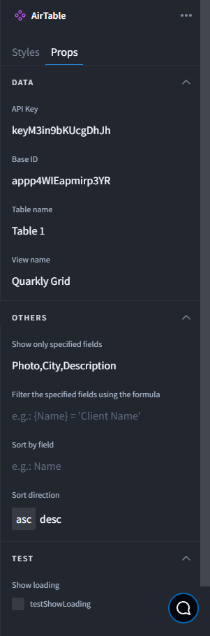
Add an AirTable component on a page and configure it. We will need API Key, Base Id, Table name, View name and Fields names for a proper work of an AirTable component.

API Key - log in to your account and click Generate API Key.

note

⚠️ By default API Key gives an access to all the functions. You’d better create a read-only key in a production version (follow the link for the manual).

API key

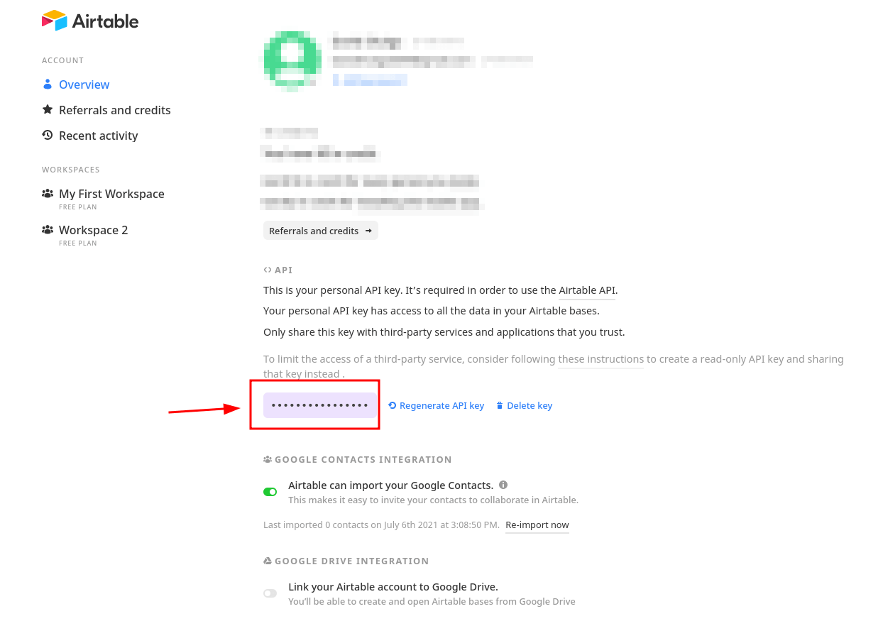
Copy an API Key from the field and paste it into the corresponding field of a props in the component

Base Id - get it from the Airtable link.

Go to the database you created and take a part of the link you need.

The database link will look like the following link:

https://airtable.com/appp4WIEapmirp3YR/tbll2gXZ050iLtA6G

Base id - appp4WIEapmirp3YR

Table name — get it in the left upper corner.

Table name

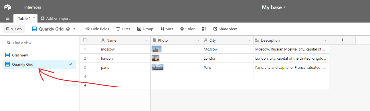
View name - the name of our view.

View name

Show only specified fields - specify fields you want to get separated by commas.

Filter the specified fields using the formula - more details here

Sort by field - several field can be specified for the sorting

Sort direction - sorting directions (ASC or DESC)

Show loading - in case a checkbox is marked you will see the Box, which appears during the data loading process. This functionality is usefull for editing styles.

Here is an example of how to fill in props:

Filled props example