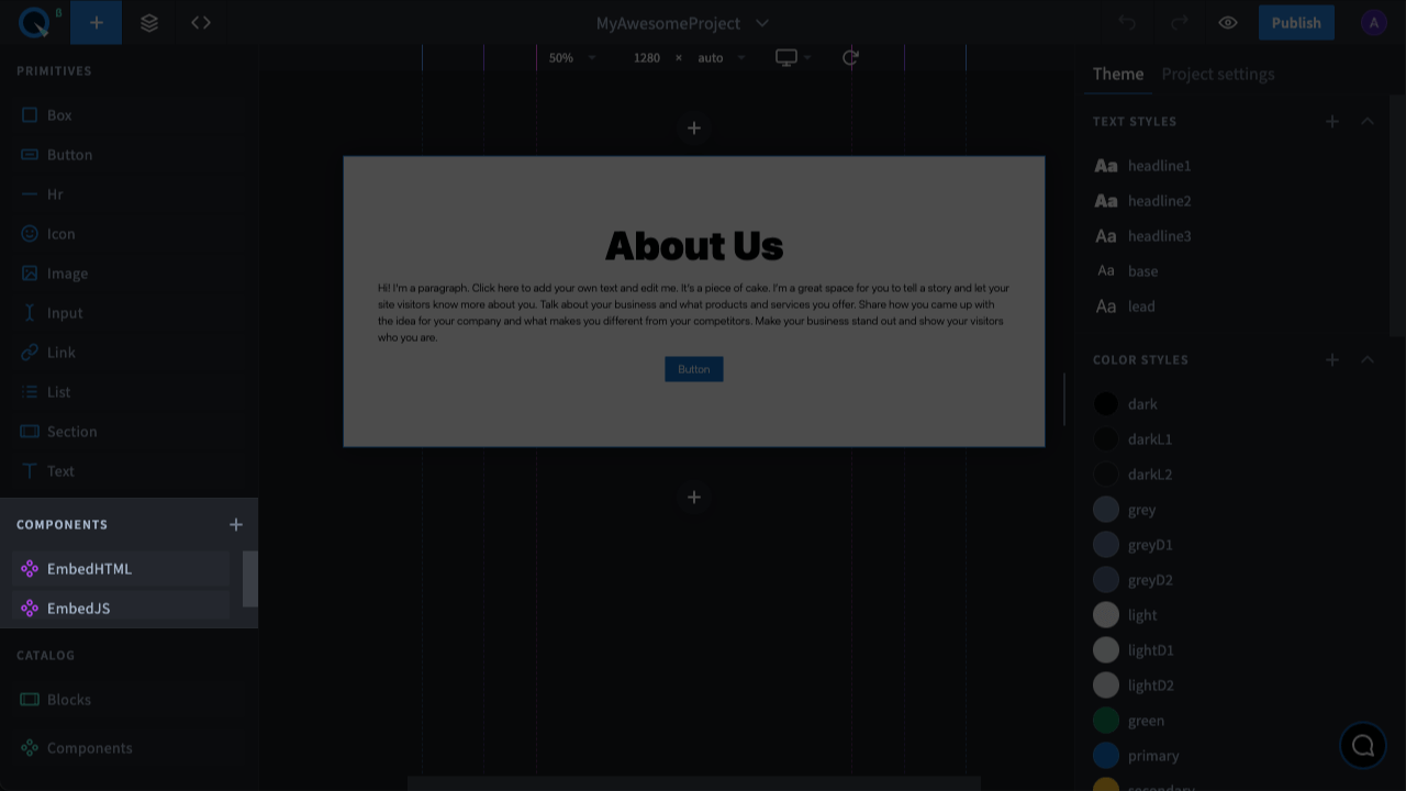
Components
This is where you'll find all the available components. They make it easier and faster to create a website design as they contain ready-to-use styles, content, and logic. In addition, components can be nested within other components.
There are 3 types of components: Primitives, Catalog components and Custom components.
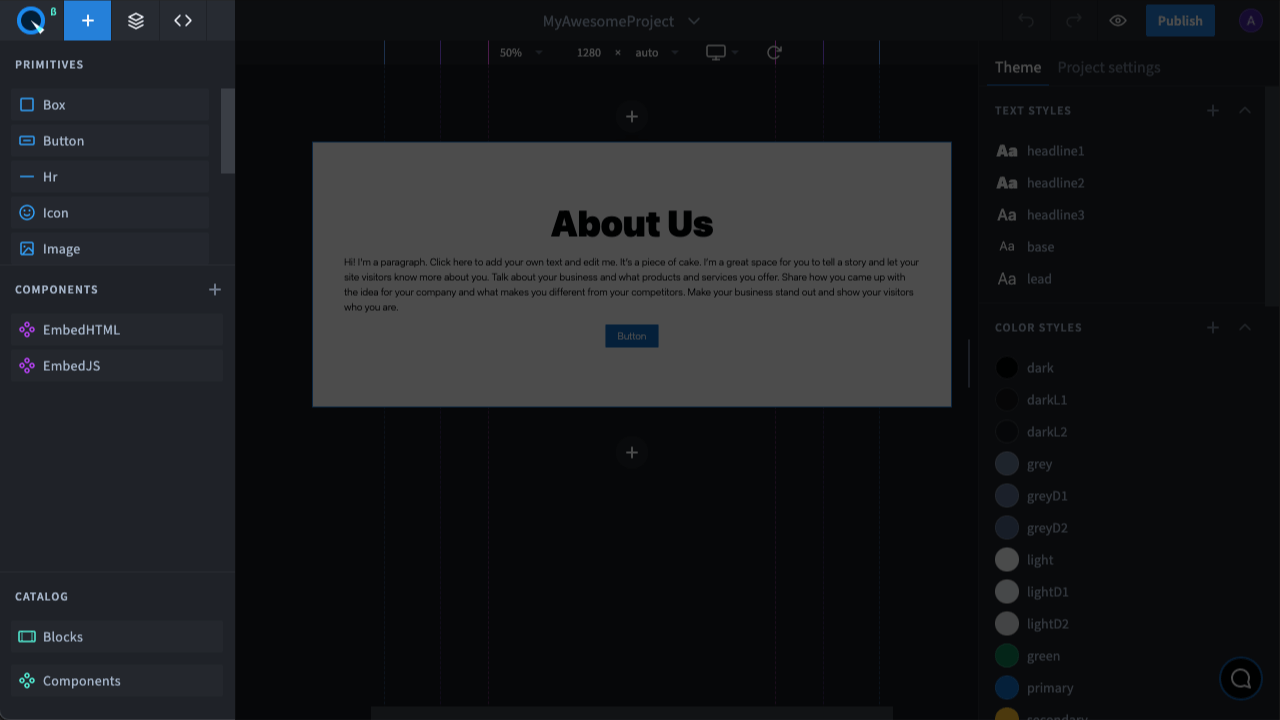
Primitives#
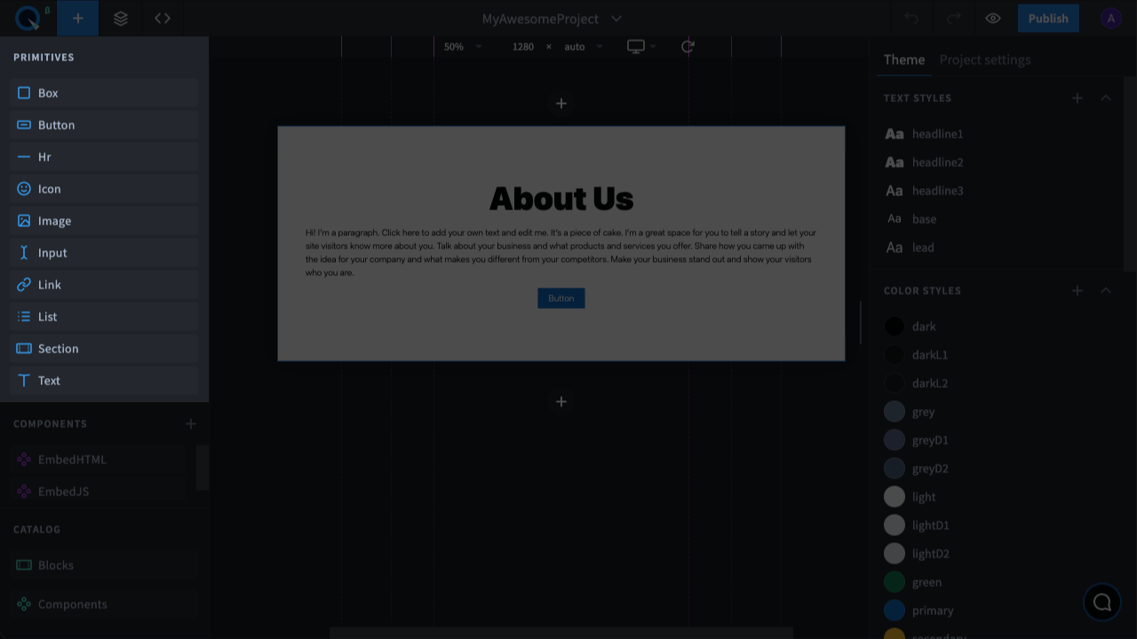
Primitives are the simplest, most basic components for a wide variety of tasks.
Catalog components#
The catalog components are different components, for infrequent use.
Custom components (created by users)#
Custom components are needed when you would like to create your own component from elements on the page or configure it in the code. Components created from page elements come with an interesting option — if you change one copy of these components, you can also change other copies accordingly using the “Push to Master” command.
Custom components, just like primitives or catalog components, have the props panel with style and functional properties. Inner properties of custom components can be transferred to the props panel and will appear under the “Props” section. With custom components, it’s also possible to import other components and modules from NPM.